Movex
Movex is a community-driven DEX built on the Sui ecosystem, combining the best of AMMs and order books into a hybrid liquidity pool. It’s designed to provide a smooth, fair, and low-slippage trading and liquidity provision experience for both traders and project developers.
RemoteOffice was brought in to redesign the app’s interface and improve its usability. Our goal was to refresh the visual design, streamline key interactions, and make the overall experience feel effortless for users navigating a high-performance Web3 product.

01
Challenge
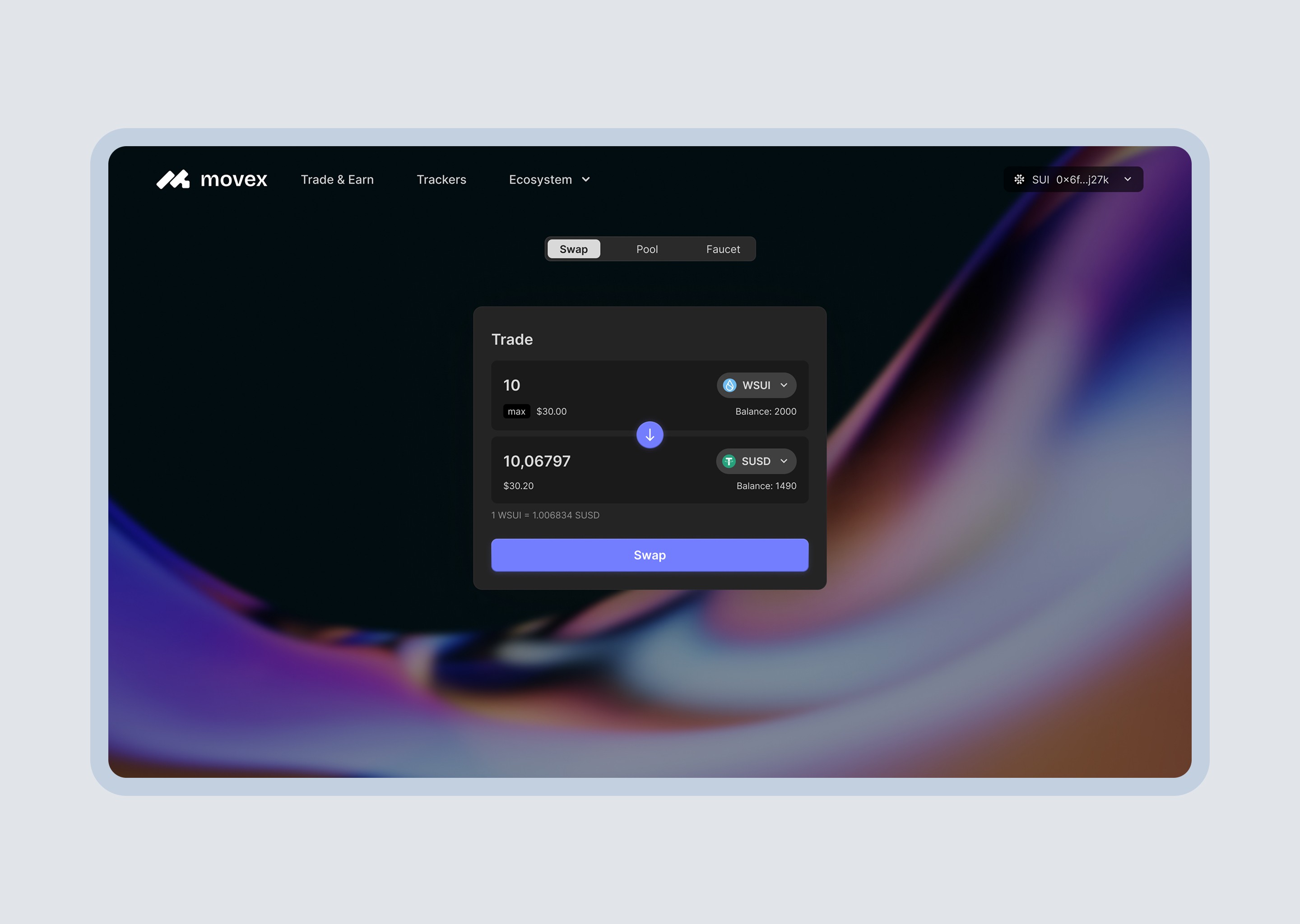
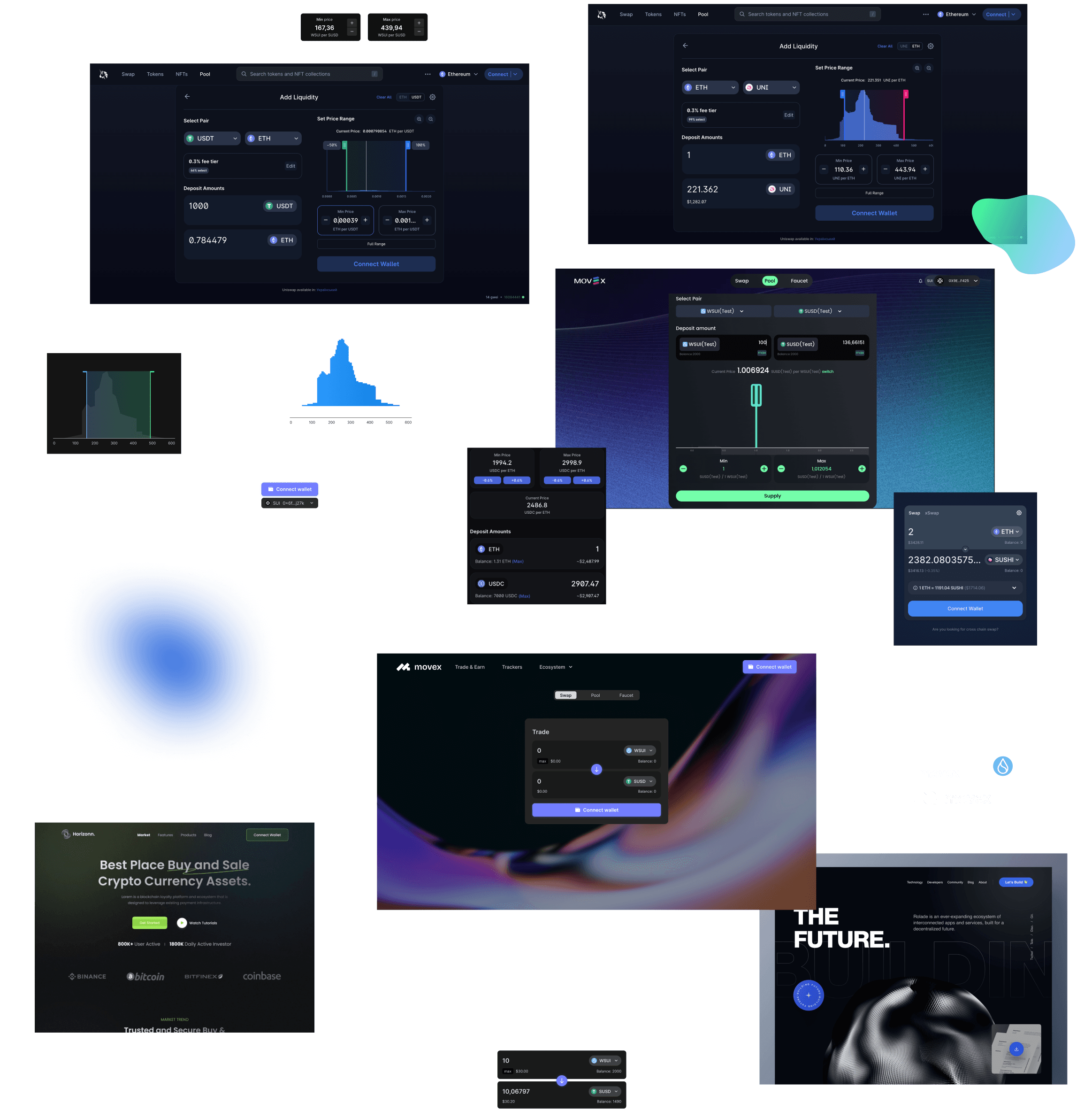
The existing app had an outdated and inconsistent interface. The overall look didn’t match the expectations of today’s Web3 users, and core flows like “Add liquidity” were difficult to use. Despite a powerful backend architecture, the UX didn’t reflect the product’s strengths.
Movex needed a cleaner, more modern visual language and a UX that guided users through complex actions with clarity and ease.


02
Approach
Audit and Research
We started by diving into the product—testing flows, evaluating the visual style, and identifying friction points. The “Add liquidity” feature was a clear pain point. We also studied leading DEX platforms like Uniswap, 1inch, and PancakeSwap to gather benchmarks and UX patterns.
Our audit revealed several key areas for improvement:
Inconsistent UI elements and typography
Unclear information hierarchy
Visual style that felt outdated for a modern DeFi product
Frustrating user experience in adding liquidity
Design Exploration and System Refresh
With the findings in hand, we started building a new design system:
Visual Style: We opted for a dark theme, in line with Movex’s branding and typical Web3 design preferences. The dark palette provides better focus on content and creates a more immersive feel.
Typography & Colors: We selected clean, readable fonts and a cohesive color system with enough contrast to enhance usability while feeling visually refined.
UI Components: Every button, toggle, input, and tooltip was redesigned to look sharp and function consistently. We kept the layout clean and minimal to improve speed and usability.
UX Improvements: Add Liquidity Flow
The biggest UX challenge was the “Add liquidity” experience. We mapped out the entire flow, simplified decision points, and made the interface context-aware to guide the user step-by-step. The updated layout reduces cognitive load and makes the process feel effortless, even for users new to the platform.
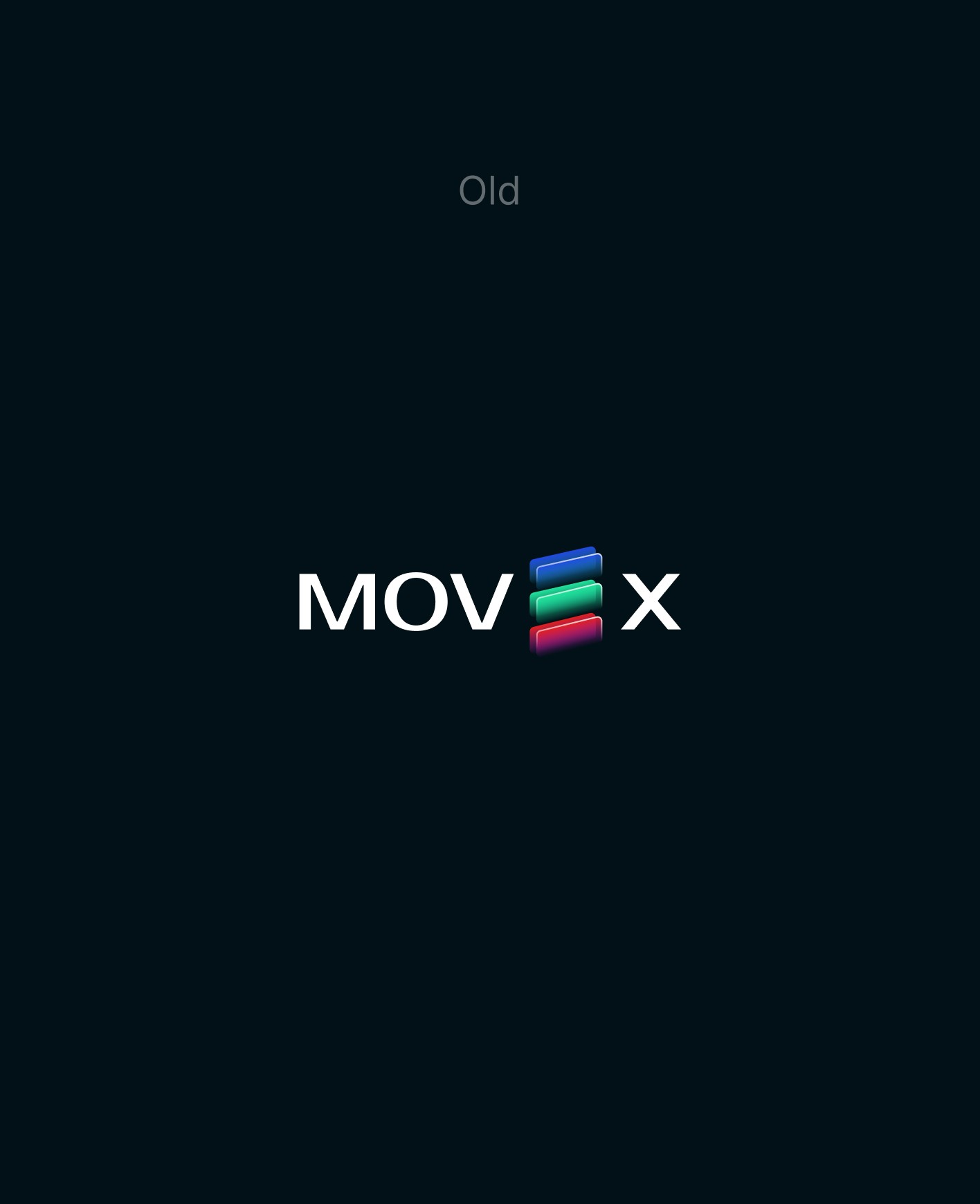
Logo Redesign
As part of the redesign, we also refreshed the Movex logo.

04
Outcome
The result is a refined and user-centered product experience. With the new design:
The app feels faster, cleaner, and easier to use
Users can add liquidity without friction
The modern aesthetic enhances trust and credibility
The product now feels as powerful as its underlying architecture
By updating the interface and streamlining the user journey, we helped Movex deliver on its promise: an advanced DEX experience that’s intuitive and accessible for everyone in the Sui ecosystem.